
Our founder, John Robert Hill, was interviewed by Stocks & Commodities Magazine back in 2002. We thought it would be fitting to share the interview with you.
Click here to read the complete interview in pdf format.

27 Friday Feb 2015
Posted in Uncategorized
Our founder, John Robert Hill, was interviewed by Stocks & Commodities Magazine back in 2002. We thought it would be fitting to share the interview with you.
Click here to read the complete interview in pdf format.
26 Thursday Feb 2015
Posted in Uncategorized
(Previously published in Futures Truth Magazine.)
1. Calculate the last period’s Typical Price (TP) = (H+L+C)/3 where H = high, L = low, and C = close.
2. Calculate the 30-period Simple Moving Average of the Typical Price (SMATP).
3. Calculate the Mean Deviation. First, calculate the absolute value of the difference between the last period’s SMATP and the typical price for each of the past 30 periods. Add all of these absolute values together and divide by 30 to find the Mean Deviation.
4. The final step is to apply the Typical Price (TP), the Simple Moving Average of the Typical Price (SMATP), the Mean Deviation, and a Constant (.015) to the following formula:
CCI = (Typical Price – SMATP) / (.015 X Mean Deviation)
CCI shows the relationship (expressed as the mean deviation) of today’s Typical Price to a moving average of Typical Prices. By measuring today’s Typical Price against a moving average of typical prices, we are in effect taking a measurement of volatility.
Now let’s see how to use this concept to stay with a trend.

Keep in mind that CCI varies from one software program to another, but then, of course, so does data vary some-what from one supplier to another. However, as long as CCI is consistent with the charts created by the soft-ware we are using, it is acceptable to take the signals generated.
Following are some illustrations to help clarify the concept.

The chart above is 5-minute chart spanning a time period of 3 days.
At “A” CCI is below the -100 line. Notice that the CCI curve rises above -100, then above 0, and finally, above the +100 horizontal lines. When we see such action by CCI, we should suspect a trend in the making. If we have other indications of a trend such as a technical study, or a 1-2-3 formation followed by a Ross hook, we should consider using CCI for our trailing stop.
Once CCI rises above the +100 (in the case above), we would resolve to hold our position until CCI once again touches the 0 line, or could be projected to touch 0 through the use of typical price calculations. A projection would indicate to us exactly at which price the value of CCI would touch 0, and we would plan to exit at that price. In this particular instance, CCI never again touched 0.

The chart above is a 5-minute chart spanning a time period of 3 days.
At “A” we see CCI crossing below the +100 line. Subsequently, it crosses through “0” and then -100 at “B.” This, combined with any other flters we may have, should alert us that a trend is in progress. Shortly after “B,” CCI touches “0,” but after that the trend begins in earnest. CCI never again touches “0” until “C.”
• CCI in and of itself is not a great indicator of the start of a trend. However, it offers an excellent alert that a trend may be forming once we see CCI crossing three horizontal lines.
• CCI should be filtered with at least one other method for confirmation of the trend. Any momentum indicator will do, because CCI is a volatility indicator.
• If we choose to not compute typical prices for purposes of CCI projection, simply exit the trade on the first bar after CCI touches “0.” Statistically, the results will be about the same as with the projection. For day traders, this may mean waiting an extra few minutes, depending upon the time frame in which the trading is done. However, for position traders this can mean an extra day or an extra week. Therefore, position traders, because they have the time to compute the projection, are probably better off doing so.
Stay tuned for the follow up posts on this excellent article!
24 Tuesday Feb 2015
Posted in Uncategorized
(Previously published in Futures Truth Magazine.)
To compute tomorrow’s Typical Price in a downtrend, we need to find the average rate of descent. It’s important to use four bars for this computation.
What we want to know is, on average, how much prices are moving in the direction of the downtrend. To find out, we measure from high to low. Here are the steps to follow:
We measure from today’s high to the previous day’s low, to see how far prices move over a two-day period. We do this for three overlapping two-day periods.
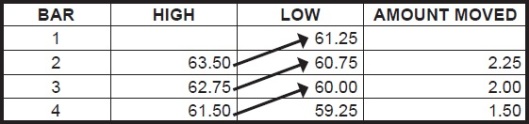
We then add those measurements together and divide by three.
2.25 + 2.00 + 1.50 = 5.75 / 3 = 1.92 (rounded) on average.
Subtracting 1.92 from the last known high (61.50), we obtain 59.58 for tomorrow’s projected low.
Next we need to determine tomorrow’s projected high.
We measure the average volatility for the last three bars. Average volatility equals the sum of the differences between high and low, divided by three.

We have:
61.50 – 59.25 = 2.25
62.75 – 60.00 = 2.75
63.50 – 60.75 = 2.75
The three differences are, 2.25, 2.75, and 2.75.
Summing these and dividing by 3 = 7.75 / 3 = 2.58
Adding 2.58 to the projected low, we obtain 62.16 for tomorrow’s projected high. 59.58 + 2.58 = 62.16.
The final step is to add the projected low and the projected high, then divide by two to come up with a Typical Price. In this case, (62.16 + 59.58) / 2 = 60.87 = tomorrow’s Typical Price.
I’m sure there are many other ways to come up with typical price. It’s a matter of choice. With today’s software in many instances being programmable by the user, we can fgure all the different ways and then make our choice.
One last thing: the formula for calculating the CCI follows, for those “do-it-yourselfers” who want to know.
Stay tuned for the follow up posts on this excellent article!
23 Monday Feb 2015
Posted in Uncategorized
(Previously published in Futures Truth Magazine.)
Let’s see how we can use the CCI study in a way that few have seen before. We’ll take it a step at a time. (The CCI study is available in most charting software packages.)
The CCI measures the mean deviation of a bar’s Typical Price relative to a moving average of N bars’ Typical Price. Typical Price may be computed as the high plus the low plus the close, divided by three. This gives a close-weighted Typical Price.
The CCI study is a volatility indicator generally displayed with three horizontal lines: +100, 0, and -100. However, CCI is theoretically, if not practically, infinitely expandable.
There is one great advantage to the scale. It is increasingly difficult for CCI to make ever greater extremes in its readings. It takes increasingly more volatility to push the CCI plot increasingly further out on its scale.
Experience and testing have shown that a 30-bar CCI works best for trend following.
Any software which allows us to insert a fictitious price bar can be used to emulate the manner in which we use the CCI at Trading Educators. However, this CCI technique can be done quite satisfactorily without the use of the fictitious bar.
To insert a fictitious reading for CCI, we need to be able to create a hypothetical price bar for what will be the next price bar. This is easily done on a daily chart with most software. On anything less than a 15-minute chart, we will have to really scramble to get the job done. The truth is that the calculation of a fictitious price bar works best on an hourly, daily, or weekly chart. Once we have placed the hypothetical bar on the chart, simply run the CCI study with the hypothetical bar in place, and see what the reading will be.
The hypothetical bar need have only one price for all fields. The open, high, low, and close can all be the Typical Price, but if our software will allow, we can also insert a high and a low if we want to do the extra work.
How do we know what the next bar’s Typical Price might be?
I’ll show two ways to do it. Then I’ll show how to use CCI as a trend-following tool that will keep us in a well established trend.
Figuring the next bar’s Typical Price in congestion has been done essentially this way since the inception of exchange trading. Each day many insiders and market makers come to the exchange with these figures in hand. They tend to sell at or near the typical high and buy at or near the typical low. If either the high or the low is violated by more than a few ticks, we see them bail out and run for their lives. This shows up on a chart as an extra long intraday bar.
Figuring the next bar’s Typical Price in Congestion
(Open + High + Low + 2(Close)) / 5 = X
2X minus The High = Next Bar’s Projected Low
2X minus The Low = Next Bar’s Projected High
O H L C
Example: (24 + 25 + 23 + 2(23.5)) / 5 = 23.8
2(23.8) – 25 = 22.6 = Next Bar’s Projected Low
2(23.8) – 23 = 24.6 = Next Bar’s Projected High
Next Bar’s Typical Price = (Next Bar’s Projected Low + Next Bar’s Projected High) / 2
(22.6 + 24.6) / 2 = 23.6
Typical Price in an Uptrend
To compute the next bar’s Typical Price in an uptrend, we need to find the average rate of ascent. It’s important to use four bars for this computation.
What we want to know is, on average, how much prices are moving in the direction of the uptrend. To find out, we measure from low to high.
Here are the steps to follow:
We measure from one bar’s low to the next bar’s high, to see how far prices move over a two-bar period. We do this for three overlapping two-bar periods.
Here is an example:

We then add the “amount moved” measurements together, and divide by three.
2 + 3.75 + 3.25 = 9. 9÷3 = 3 on average.
Adding 3 to the last known low (29.25), we obtain the number 32.25, which is the next bar’s projected high.
Next we need to determine tomorrow’s projected low.
We measure the average volatility for the last three bars. Average volatility equals the sum of the differences between high and low, divided by three.

We have:
31.00 – 29.25 = 1.75
30.25 – 27.75 = 2.50
28.00 – 26.50 = 1.50
The three differences are 1.75, 2.50, and 1.50.
Summing these and dividing by 3 = 5.75÷3 = 1.92 (rounded).
Subtracting 1.92 from the projected high (32.25), we obtain 30.33 for the next bar’s projected low.
The final step is to add the projected high to the projected low, then divide by two to come up with a Typical Price.
In this case, (32.25 + 30.33) / 2 = 31.29.
It’s important to realize that this is not an exact science, but it’s surprising how often we can come within a tick or two of being right.
Stay tuned for the follow up posts on this excellent article!
18 Wednesday Feb 2015
Posted in Uncategorized
Over the last several days, we have published Minor Reversal Patterns, as published in John Hill’s book, Technical and Mathematical Analysis of Trends in the Commodity and Stock Markets. Feel free to browse the blog for previous pattern posts, and as always, if you have any questions please don’t hesitate to ask.
The reversal patterns listed are based on only several days of action. They can be very useful when used in combination with the overall chart pattern and when used with other technical tools. I will emphasize that these factors or formations used by themselves can result in trouble and lead to whip saw action. Also, market action may not be exactly as shown. There may be several more days of movement. My intention is to introduce new concepts.

When a market makes a new high for 5 days, it indicates the momentum has shifted to the upside. Inside days can be ignored in counting the five days. Commodity may be purchased on a reaction.
 When you have a wide spread which closes above a previous rally top, this strongly indicates a change in trend.
 This reversal formation is one that signifies the end of a correction against the prevailing trend. This is usually indicated by:
Copyright 2015, John Hill & Futures Truth Company
18 Wednesday Feb 2015
Posted in Uncategorized

Price broke out of a channel formed in January. Since, price has shown nice follow through up. Major resistance at the December, 2014 highs. If price carries through, Mini Dow could reach the wave target equal to channel length shown as equal blue lines.
Lundy Hill
17 Tuesday Feb 2015
Posted in Uncategorized
Over the last several days, we have published Minor Reversal Patterns, as published in John Hill’s book, Technical and Mathematical Analysis of Trends in the Commodity and Stock Markets. A few more followup posts on this topic will be posted. Feel free to browse the blog for previous pattern posts, and as always, if you have any questions please don’t hesitate to ask.
The reversal patterns listed are based on only several days of action. They can be very useful when used in combination with the overall chart pattern and when used with other technical tools. I will emphasize that these factors or formations used by themselves can result in trouble and lead to whip saw action. Also, market action may not be exactly as shown. There may be several more days of movement. My intention is to introduce new concepts.

Wide spread and high volume at “A” followed by more than complete loss in next three days with modest to high volume and low closing is a sign of weakness.

“A” in all cases is a rally top.
Shown are four examples of upthrust action, which indicate a superior quality of supply with a good bet that entire recent action has been one of distribution and a good-sized downmove is about to take place. It is best when heavy volume is present on the breakout, which would indicate abundant supply
(a) In this example, one day’s action breaks above a previous rally top, volume shows an increase, and the close is above previous rally top. However, on the following day, the market may make a slightly new high and then proceeds to sell off the balance of the day. It closes near the bottom below the previous day’s low.
(b) It takes 2 days for the supply forces to overcome demand in this example. On the first day you have breakout action above a previous rally top. The second day is generally characterized by heavy volume and a narrow range or spread. On the third day, supply forces win the battle. The stock or commodity sells off all day. The daily range is increased. The close is on or near the low and below the close of the day that it broke out of the formation.
(c) In this example, the commodity exceeds a previous rally top by a good margin (and all the technicians around the country talk about the big breakout). However, there is no follow-through on the next day. This is followed by a number of inside days (inside the range of breakout day) and you may have an attempt to go through the top. When this fails, the demand forces give up and you have a day of heavy supply, which sells back down below the rally top, closes at or near the bottom and below the low of the breakout day.
(d) In this case the previous rally top is exceeded by a gap. The day’s action shows a narrow range and heavy volume indicating abundant supply. Demand forces give up the following day. The daily range increases. Close is at or near the low, below the rally top and below the close on the day just preceding the breakout.
Copyright 2015, John Hill & Futures Truth Company
16 Monday Feb 2015
Posted in Uncategorized
Over the next several days, we will publish Minor Reversal Patterns, as published in John Hill’s book, Technical and Mathematical Analysis of Trends in the Commodity and Stock Markets.
The reversal patterns listed are based on only several days of action. They can be very useful when used in combination with the overall chart pattern and when used with other technical tools. I will emphasize that these factors or formations used by themselves can result in trouble and lead to whip saw action. Also, market action may not be exactly as shown. There may be several more days of movement. My intention is to introduce new concepts.
 On the day after breaking minor bottom, some buying came in. However, on balance it shows lack of much follow-through. Shorts were not in a hurry to cover. Continued weakness is indicated on day (1) if lack of follow-through on upside is still apparent and the spread is relatively wide with a bottom closing.
 A shakeout is characterized by one or several days of movement below a formation and this is followed by an equally fast recovery. The recovery shows widening spreads and increasing volume.
Copyright 2015, John Hill & Futures Truth Company
13 Friday Feb 2015
Posted in Uncategorized
Over the next several days, we will publish Minor Reversal Patterns, as published in John Hill’s book, Technical and Mathematical Analysis of Trends in the Commodity and Stock Markets.
The reversal patterns listed are based on only several days of action. They can be very useful when used in combination with the overall chart pattern and when used with other technical tools. I will emphasize that these factors or formations used by themselves can result in trouble and lead to whip saw action. Also, market action may not be exactly as shown. There may be several more days of movement. My intention is to introduce new concepts.
 When a market goes below previous minor low and then springs up to a new high on widening spreads and increase in volume, it indicates good quality demand and show be bought on first reaction. The entire recent market action has been one of accumulation.
 Bottom – Frequently the case will be seen where a market is going down and spreads or ranges are getting narrow, then you have a relatively wide spread on the upside and close could be within the range of preceding day. This is an example of demand overcoming supply and might be purchased, if sufficient other evidence is present.
Top – Reverse of above.
Copyright 2015, John Hill & Futures Truth Company
13 Friday Feb 2015

